MoMA
Search
Redesigning how 2M+ visitors discover art — from keyword lookup to narrative-driven exploration
Digital Product Design Fellowship at MoMA
1.8 million users search MoMA's website every year. The brief was direct: the search was being rebuilt on Elasticsearch, which would make it faster and more relevant — and MoMA wanted to use that as an opportunity to rethink what search could do.
My role was to research the problem space, design toward that opportunity, and build a working prototype to test it. Operating within an active project at a major cultural institution, with real constraints and real feedback from a team who knew the collection deeply.
Role Product Designer, UX Researcher, Developer
Duration 5 months (Oct'25—Feb'26)
Stack React, TypeScript, Vite, Anthropic API, Railway, Vercel
Team MoMA Digital Product Team
Results without meaning. Volume without direction.
MoMA's internal research identified three compounding failures in how search was performing:
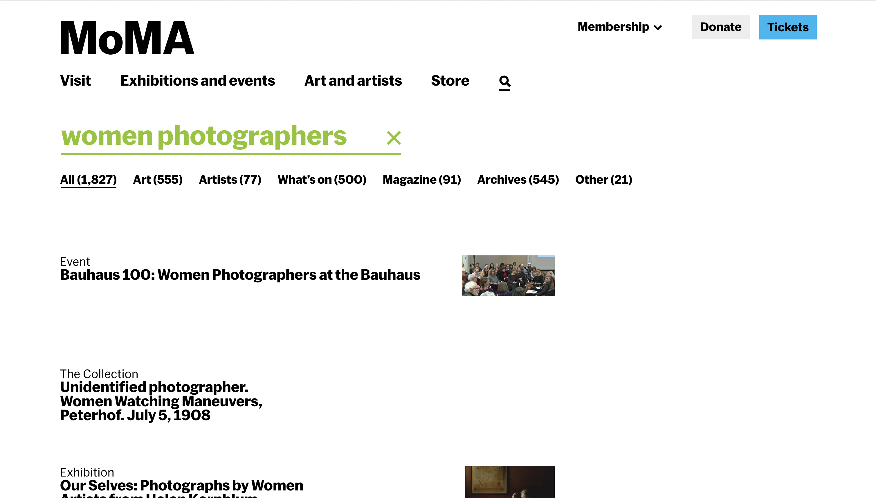
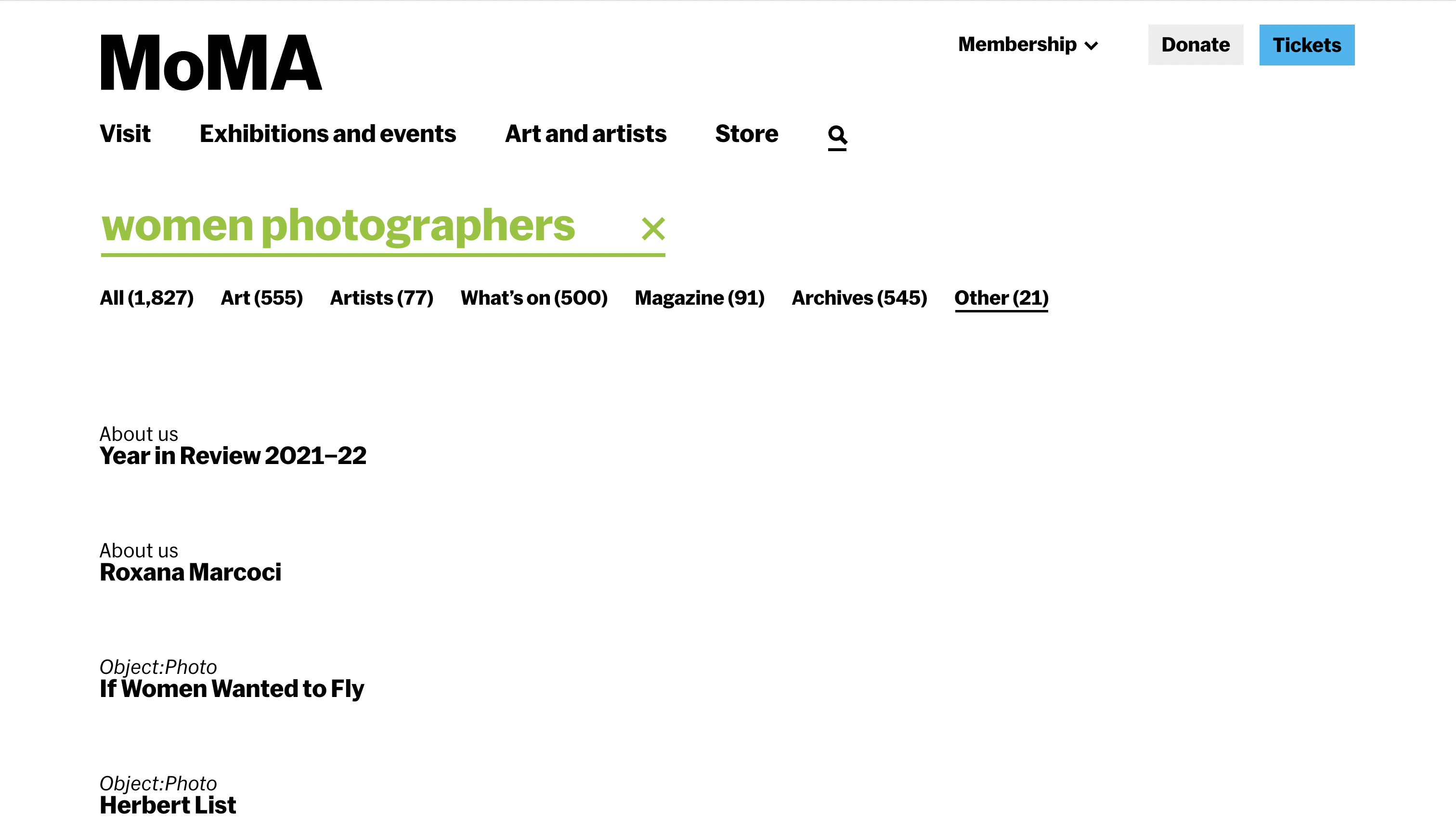
The failure wasn't just technical. A search for "women photographers" returned 1,796 results. A flat, uncategorised list mixing collection objects, magazine articles, exhibition records, and archival materials with no indication of why any result belonged near another. The results didn't cohere. They just accumulated.
The deeper issue: the search was organised around how MoMA catalogues its collection. By medium, department, date, and so on, not around how people actually think about art. Students searching thematically, researchers looking for context, visitors planning a visit: each of them needed something the existing interface couldn't offer.
The current search — "women photographers"
The query "women photographers" returns 1,827 results across mixed content types — but offers no narrative, no hierarchy of meaning, no sense of why any result is relevant to another.
Starting from what MoMA already knew
MoMA's internal research and telemetry was the foundation. The museum had already conducted usability testing, index page studies, and visitor intent surveys — including a January 2024 study of the Collection, Artists, and Art Terms pages. That research showed that users wanted more narrative and contextual information, better connections between artists, movements, and periods, and more sophisticated search. The problem was well-documented. My job was to design toward it.
Key findings from that research that shaped the brief:
- Primary audiences were students, researchers, learners, and teachers
- The Collection page received the most traffic — 106k events vs 48.9k for Artists
- Users consistently requested thematic groupings and better integration of educational content
- Engagement dropped rapidly after the first few results — users weren't finding reasons to go deeper
- The more systematic the search, the more it failed people browsing conceptually
Competitive landscape analysis across non-museum and museum search contexts: Google, Spotify, Pinterest, Netflix, and museum platforms including the Rijksmuseum, Cooper Hewitt, Europeana, and the Art Institute of Chicago. The pattern that held across the strongest performers: they gave users context before they gave them choices. They helped people understand what they were looking at, not just return what matched.
Desk research into museum metadata structure confirmed the structural issue: collection taxonomies are built for cataloguers. Department, medium, provenance, date — these categories are invisible to someone searching conceptually. No amount of faster or more accurate retrieval would fix a vocabulary mismatch.
Two vocabularies with no bridge between them
The research surfaced a structural mismatch that no amount of interface polish could fix: the museum's metadata and the visitor's language operate on entirely different logics. The diagram below shows what this looks like in practice and where the intervention needed to happen.
What if search worked like a knowledgeable docent?
The framing that anchored the entire project came from the brief itself: instead of a search that retrieves, what if it oriented? A docent doesn't hand you a list of artworks. They understand what you're interested in, tell you a story about it, and guide you toward things you didn't know you'd want to find.
Three core failures to solve for: results lack context (disconnected lists with no framing), filtering is passive (requires users to already know what they want), and the structure is static (the same template regardless of what or why someone is searching). The response to all three was the same: narrative.
From filters to narrative — and the feedback that pushed it further
The first round of mockups took a conventional approach: static sections (History → Art and Artists → On View), faceted filters in a sidebar, content organised by type. It was a reasonable improvement on what existed. It wasn't enough.
The team's feedback on those mockups was the turning point. The note, quoted directly: "I think there are a lot of good ideas here but also that we've currently too focused on filters and other search UI paradigms that are quickly becoming outdated. The key thing missing I think is narrative."
Six specific directions followed from that feedback:
- Create an overarching story with whatever content MoMA has about a topic
- Suggest further roads for exploration and explain why someone might want to go in those directions
- Let results transform based on intent — if someone is searching historically, start with history; if they're planning a visit, surface on-view content first
- Replace passive filters with active guides that hint at what's findable and why it matters
- Consider the narrative as a persistent layer — always visible, updating contextually as users explore
- Let the UI itself change based on the type of search input
This reframe changed everything. The sections became adaptive. The filters became contextual guides with live counts and rationale. The results page stopped being a page and started being an experience.
Building the component system in Figma before the prototype in code
The Figma work ran in parallel with the prototype build — not as a handoff document but as the design thinking tool. The component library included: narrative summary blocks, thematic path cards with image + one-line preview + result count, era filter chips with count and curatorial rationale, adaptive section headers, content-type sub-headings (Key Publications, Scholarly Articles, Featured Works), timeline cards with contextual rationale text, and the persistent right-side navigation sidebar that updated as you scrolled.
The full worked example was built out for "women photographers" — real historical content from MoMA's collection spec, real filter counts from the collection, real publication titles and article references. Not a wireframe with Lorem Ipsum: a design that could actually be handed to an engineer.
A results page that reorganises itself around what you're actually looking for
The core mechanic: intent detection. The system classifies each query and reorders the results page accordingly — so a historical search leads with History, an artist search leads with Art and Artists, a visit planning search leads with On View. Same content, different hierarchy, depending on what the user is trying to do.
Mockups were built in Figma; the interactive prototype used React, TypeScript, and the Anthropic API for semantic interpretation. Deployed on Railway (backend) and Vercel (frontend), using data per the team's guidance while full collection API access was pending.
The three adaptive flows:
Query: "women photographers." System detects historical/educational intent. Results lead with a narrative overview, thematic exploration paths (Through portraiture, Documentary vision, Conceptual practices), a contextual history section with timeline, then art and artists, then on-view.
Query: "Cindy Sherman." System detects direct lookup intent. Results lead with the artist — works prominently displayed, biography, related movements — with contextual history and connections as supporting content rather than the lead.
Query: "photography exhibitions." System detects practical intent. Results lead with On View — current exhibitions, floor locations, dates — with research and historical content subordinated. Same query, different user need, different page.
Filters aren't passive checkboxes — each shows a count and a rationale. "1970s–1980s (38 works · Feminist art and the Pictures Generation)" tells you what you'll find and why it matters before you click. The filter becomes a curatorial nudge.
Suggested paths each carry a one-line preview: what you'll find if you go there, and why it's worth exploring. "Documentary vision — Dorothea Lange and Margaret Bourke-White used the lens as a tool for social change. 28 articles." Context before commitment.
Two parallel tracks: Figma mockups and a live prototype
The design process ran on two tracks simultaneously. In Figma: high-fidelity mockups of the full results page, the History expanded view, and the adaptive layout system — building out the component library (narrative summary blocks, contextual filter chips with counts, thematic path cards with previews, adaptive section headers) and the content spec for the "women photographers" and "Cindy Sherman" worked examples.
In code: a React/TypeScript/Vite prototype deployed on Railway and Vercel, using the Anthropic API for semantic query interpretation. The team's guidance was to build against dummy data first — which meant I could validate the full interaction model and adaptive logic before being dependent on live collection API access.
Intent classification:
Adaptive section logic:
Other decisions along the way:
- Explicit content-type headings within sections: Early mockup feedback flagged that mixing publications, articles, and artworks without labelling them was confusing. Added clear sub-headings — "Key Publications," "Scholarly Articles," "Featured Works" — within each section.
- One-line previews on exploration paths: Each suggested path now carries a preview of what you'll find, not just a label. "Documentary vision → 28 articles exploring photojournalism, social documentation, and activist photography." Users needed to know what they were committing to before clicking.
- CORS and JSON resilience: Railway backend required explicit header configuration; AI responses needed fallback parsing for partial or malformed JSON without breaking the UI.
8 users. 4 tasks. The adaptive layout as the thing being tested.
Tested with 8 participants, including 3 art history graduate students — deliberately included because the system was designed for serious users, not just casual browsers. If it didn't hold up for people who already knew the collection, it wasn't solving the right problem.
The testing protocol had four tasks designed to stress-test the specific claims of the design:
- Open-ended exploration — show the narrative results page for "women photographers" with no priming. What do users notice? Do they understand the structure without being told?
- Intent reordering — give two contrasting queries ("photography exhibitions" then "Cindy Sherman") and ask users to notice what changes. Does the adaptive layout land, or does it read as inconsistency?
- Autocomplete with context hints — test whether the intent-aware autocomplete ("women photographers · movement, 1970s–present" vs "women photographers · currently on view") actually guides users or adds noise.
- Spell correction and edge cases — test "Did you mean" states and near-miss queries.
The narrative structure was the clearest win. Users understood why sections were in the order they were. The art history graduate students in particular responded to having results contextualised — not just labelled. One noted that it felt like being handed a reading list rather than a search results page, which was precisely the intention.
Images needed to lead. The initial card design was text-heavy: title, narrative label, then image. Users wanted to see the work first. Inverted the hierarchy: image leads, narrative text supports. The card started reading more like a curated recommendation and less like a database entry.
No dead ends read as confidence. The ability to always see where you could go next — specific, AI-generated pivot options rather than a generic "explore more" — made users feel in control rather than at a dead end. This was noticed positively without being prompted.
The breadcrumbs needed to be findable. The session trail existed and was well-received once users were shown it — but most didn't find it unprompted. It was sitting in a location that went unnoticed. Users who noticed it understood it immediately; most didn't engage with it. Post-testing fix: added hover states to make the trail feel interactive rather than decorative, so the path back to results is clearly actionable rather than just informational.
Speed was a trust signal. When the API took more than 3 seconds to respond, users assumed it wasn't working. Added a loading state that shows partial information (which works are being considered) rather than a spinner — kept users engaged during latency.
Three specific changes that came directly from testing
1. Card hierarchy — image first. Early cards led with title and narrative label, with the artwork image secondary. Users wanted to see the work before reading about it. Inverted: image leads, text supports. The result reads more like a recommendation and less like a database row with a thumbnail. This also meant bumping the image area significantly — small thumbnails weren't enough for people to make a judgment about whether a work was relevant to them.
2. Breadcrumb visibility. The session trail was technically there — users who were shown it immediately understood its value. The problem wasn't location, it was that users read it as decorative rather than functional. Added hover states — underline on hover, cursor change, subtle colour shift — so the path back to results reads as clearly clickable rather than just a label. The structure stayed the same; the affordance got clearer.
3. Pivot specificity. The early version had a generic "explore more like this" call to action. Replaced with three AI-generated specific pivot options per result — "go deeper into X," "explore the contrast with Y," "see this through a different cultural lens" — so users could always see where they might go before deciding whether to go there. This is also what made the no-dead-ends quality actually legible rather than just present.
The infrastructure should disappear into the result
Every time the interface made the AI legible, surfacing query classification steps, showing which terms were being matched, users shifted from exploring to evaluating. They started testing the system instead of using it. The value of semantic interpretation isn't visible in the process; it's only visible in the quality of what comes back. The right measure isn't "did the AI do something impressive" — it's "did the user find something they couldn't have found otherwise."
Designing within an institution means designing with constraints that are features
This wasn't a blank canvas project. MoMA has an existing collection structure, an existing engineering direction (Elasticsearch), an existing visual identity, and a supervisor with a clear point of view on what good looks like. Working within those constraints wasn't a limitation, it was the brief. The most useful skill in this context wasn't creativity in the abstract; it was knowing which constraints were load-bearing and which were open to challenge.
Feedback that redirected the project was the most valuable part of the process
The first mockups were competent. They would have made a reasonable case study. The team's note that they were "too focused on filters and other search UI paradigms that are quickly becoming outdated" was completely correct. The project became significantly more interesting after that redirect, and the prototype that emerged from it was genuinely different from anything that existed in the space. Getting that feedback early, and acting on it fully rather than partially, was the move that mattered.
Three directions worth pursuing
1. Saved searches and persistent collections. Right now a session disappears when you close the tab. The natural next step for students and researchers — the primary audience — is the ability to save a search, return to it, build on it across multiple visits, and export it. A saved search isn't just a convenience feature; for a researcher, it's the difference between a tool and a workflow.
2. Handoff to the museum visit journey. The prototype lives entirely online. But MoMA is a physical institution — and a search session that builds a narrative set of works could directly inform a gallery visit. Connecting the digital search experience to wayfinding, gallery availability, and on-view status would close the loop between finding something and actually standing in front of it.
3. Curatorial knowledge as training data — and transparency about what's human vs. AI The prototype's narrative intelligence is only as good as what it's drawing from. A meaningful next step is using MoMA's actual curatorial knowledge — exhibition essays, wall text, acquisition notes, scholarly catalogue entries — to fine-tune the API's understanding of how the museum talks about its own collection. Alongside this, building a layer of human-curated pages for the highest-traffic searches: The Starry Night, Dalí, Warhol, Basquiat — queries that arrive in volume every day and deserve a response that reflects real institutional voice, not just a well-prompted model. The system could surface both, with a clear signal to the user about which is which: a small label distinguishing curatorially authored content from AI-generated narrative. Not as a disclaimer, but as a feature — giving users a way to understand what they're reading and why it might read differently.
This project stayed within institutional constraints — practical, evidence-based, designed to fit within MoMA's existing infrastructure. My self-initiated project, Through asked the same question from the opposite end: no keyword entry, no results page, no taxonomy — just a concept and a branching map through the collection.
The two projects are in conversation. One works within the museum's logic. The other ignores it entirely.