
IMDb serves as a valuable resource for mainstream entertainment followers to learn about movies, shows, and industry updates. However, while it provides extensive information, the platform falls short in meeting user needs for personalized content discovery and social connection. The project aimed to reimagine IMDb's information architecture to better serve entertainment trend followers.
Our team wanted to reimagine IMDb's information architecture to better serve entertainment trend followers. The user group we focused on consists of mainstream entertainment followers—those who regularly engage with movies, TV shows, and celebrities. These individuals use IMDb fairly often or have sufficient past exposure to be familiar with the site's features and content.
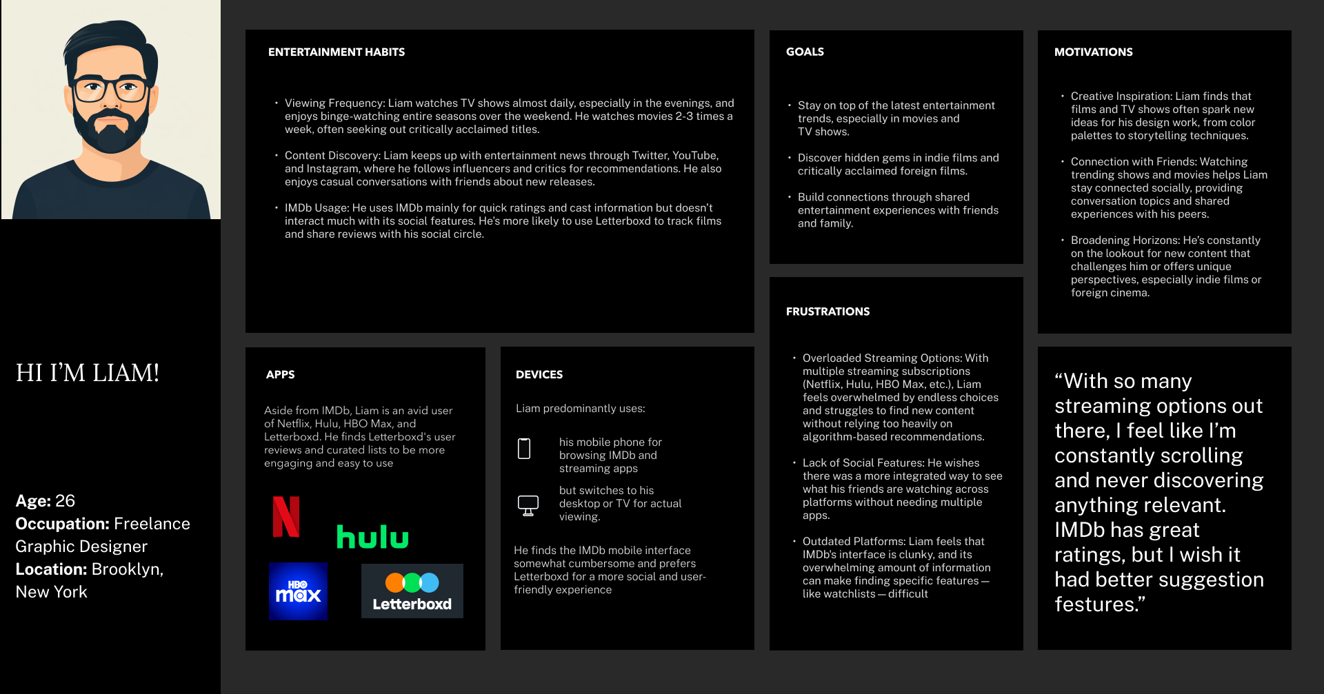

The habits and pain points of mainstream entertainment followers using IMDb were examined to gain insight into their user experience. Areas of improvement and unmet needs were identified and used to guide optimizing the platform for a more personalized, intuitive, and engaging experience.
Research findings:We created a survey to collect insights on user demographics, IMDb engagement, contributions, and feature preferences, providing a broader perspective on user behavior.
Users report minimal engagement with social features, preferring platforms like YouTube and Letterboxd for real-time discussions with fellow entertainment consumers.
The platform struggles to deliver content that aligns with individual tastes and preferences, resulting in generic recommendations.
Users reported significant difficulty finding specific features and navigating through the site's dense information architecture.
The site's crowded layout and weak visual hierarchy created a significant cognitive burden. It diminished the user experience, creating immediate barriers to engagement before navigation even began.
The evaluation revealed significant gaps in IMDb's social and personalization features compared to modern platforms.
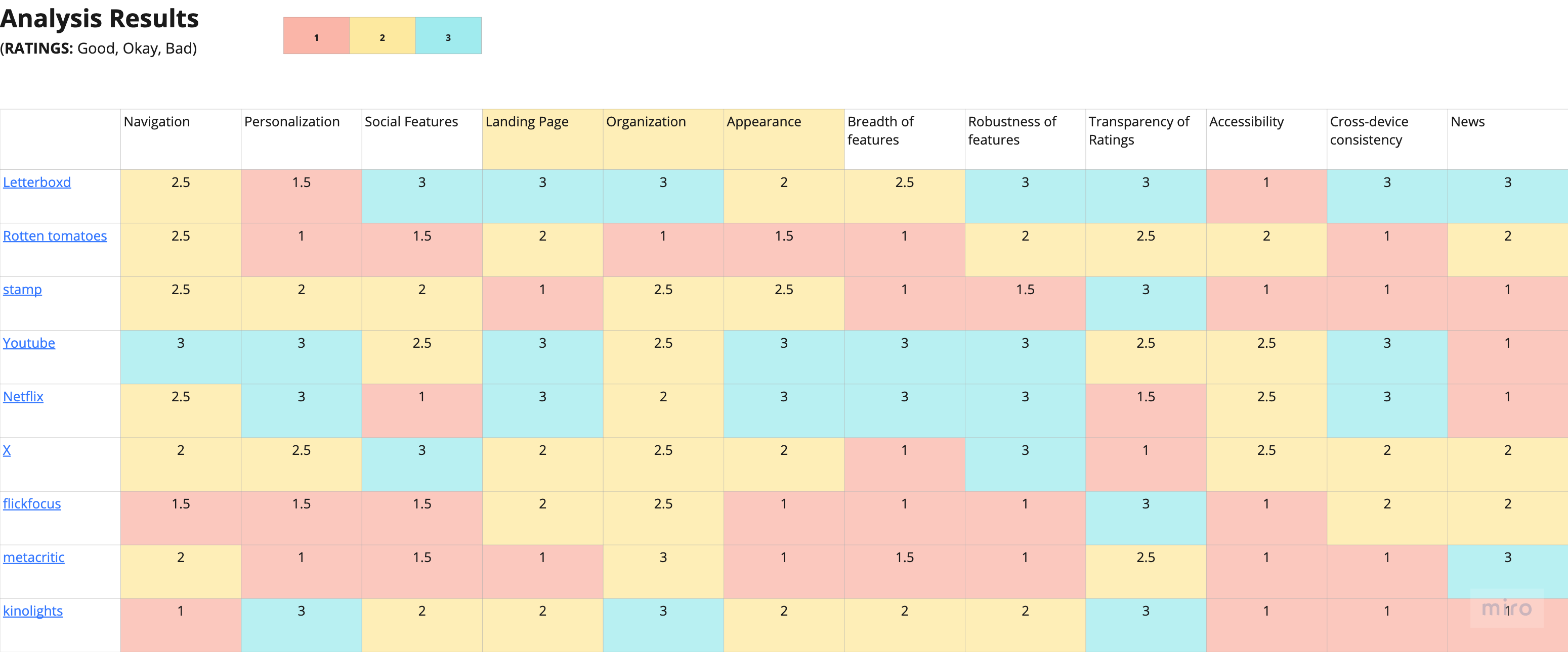
This analysis helped identify key opportunities for IMDb to differentiate itself by combining its comprehensive database with modern social and personalization features while maintaining its position as the authoritative source for movie and TV show information.
The purpose was to understand how menu item names were interpreted and to gather insights that could inform the development of the site architecture for usability testing.
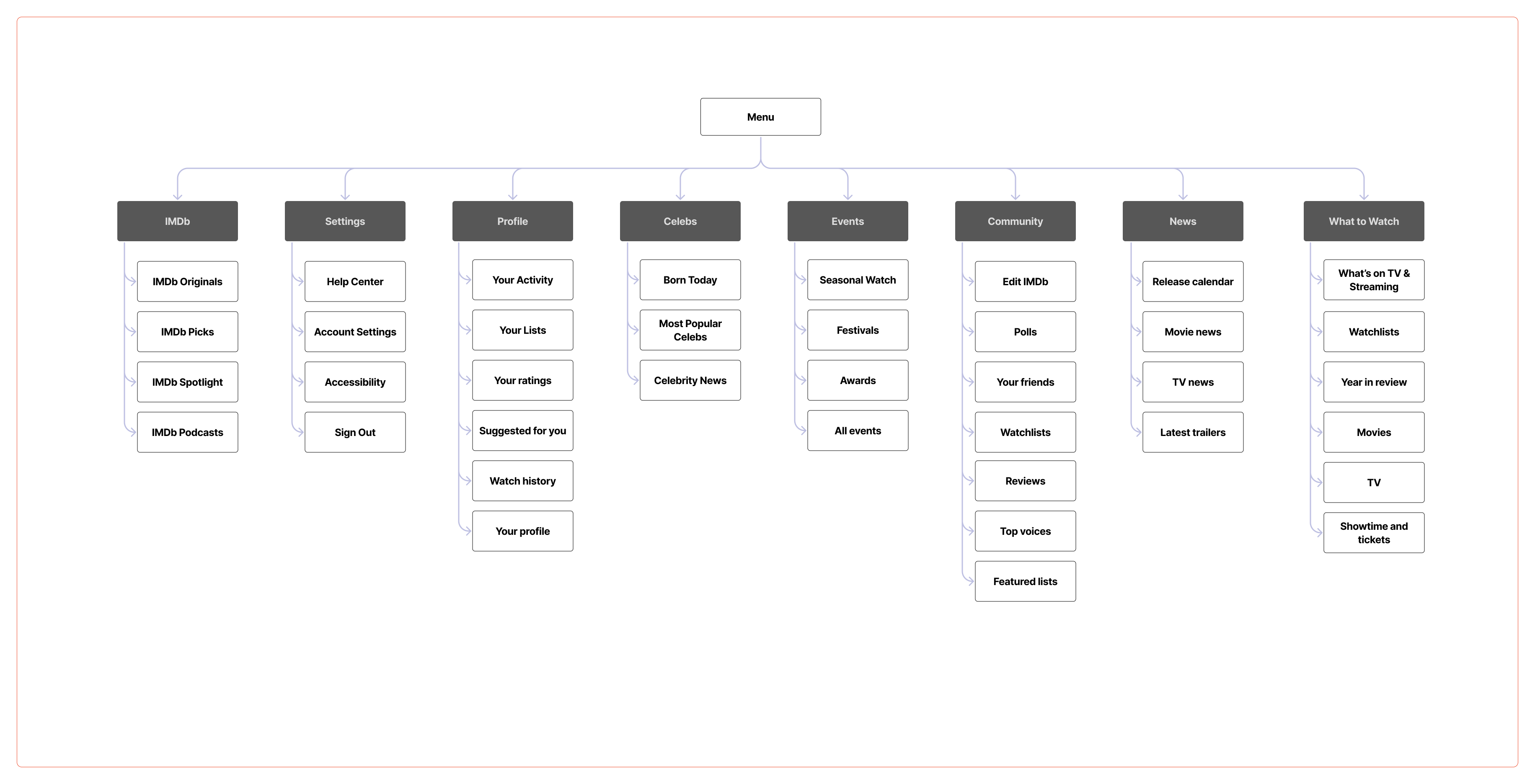
Card Sorting Study ResultsUsers preferred consolidating these elements for a more streamlined experience.
 Before
 After
After
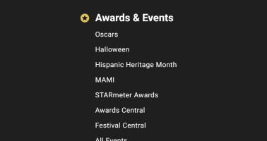
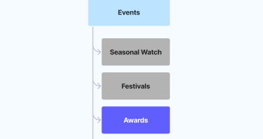
Participants found the old awards menu confusing and overwhelming.
 Before
 After
After
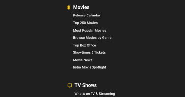
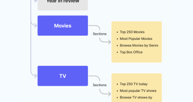
Participants found the subcategories of Movies and TV Shows redundant.
 Before
 After
After
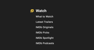
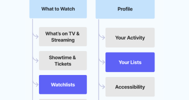
Users were more inclined to the terminology "What to Watch" as a larger bucket, compared to "Watchlists."
 Before
 After
After
What We Did:
Study details:
The goals were to evaluate how easily users could find information within the proposed information architecture and to identify areas where they struggled. These insights would guide refinements to the new site map, ensuring a more intuitive structure.
Users preferred consolidating these elements for a more streamlined experience.
Before
After
Participants found the old awards menu confusing and overwhelming.
Before
After
Participants found the subcategories of Movies and TV Shows redundant.
Before
After
Users were more inclined to the terminology "What to Watch" as a larger bucket, compared to "Watchlists."
Before
After
Key Changes Based on Tree Testing
Our tree testing with users revealed several navigation improvements we could make to the site structure.
The two most significant changes involved relocating and renaming key sections based on user expectations.
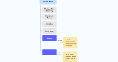
Path taken by 5/6 participants indicate that they expected to find this menu item under "What to Watch."
 Before
 After
After
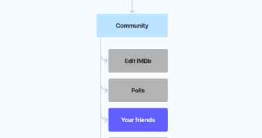
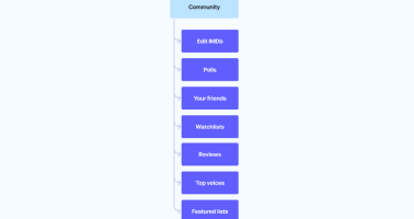
In our tree test question focusing on finding how to post reviews, 2 participants chose "Contributor Zone" as their answer. This was due to confusion regarding what the term meant. We changed it to "Edit IMDb" to make the context more explicit.
 Before
 After
After
These changes directly address user feedback about IMDb lacking personal connection and community engagement.
2. Streamlined NavigationThese changes resulted in a 70% success rate in tree testing, showing improved navigation clarity.
3. Personal Experience HubThese features help users track their own engagement while connecting with others.
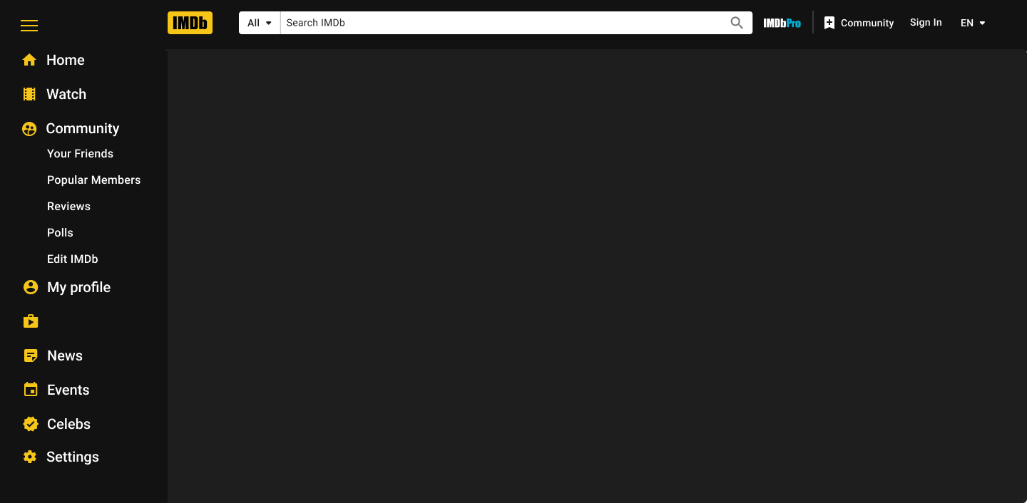
Interviews and competitor analysis revealed that a vertical navigation would be the most intuitive as it gives the user a constant sense of where they are on their user journey. The previous drop down navigation menu on the site covered the user's screen, thereby interrupting the user flow.
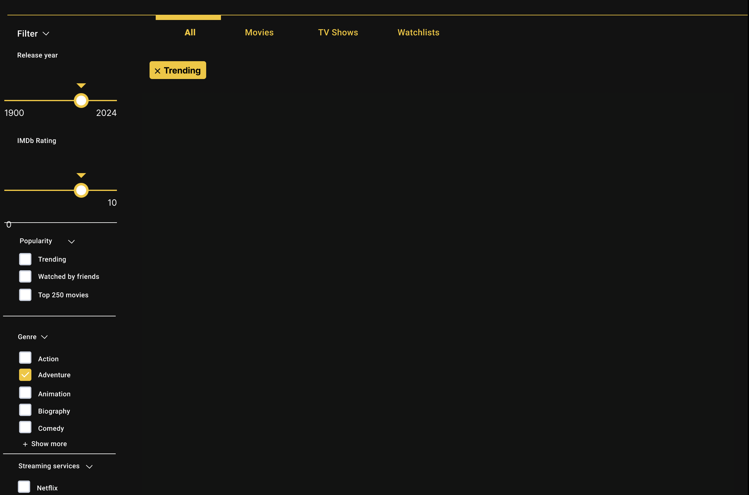
With mainstream trend followers as our target audience, we needed to improve content discovery by making it more personalized, relevant, and socially-backed. We included these filters to help them search for popular content in a more nuanced way. Key design choices include clear filter categories and flexible customization, enabling users to easily tailor results to their interests. This balances personalization with social influence, simplifying navigation and enhancing decision-making.
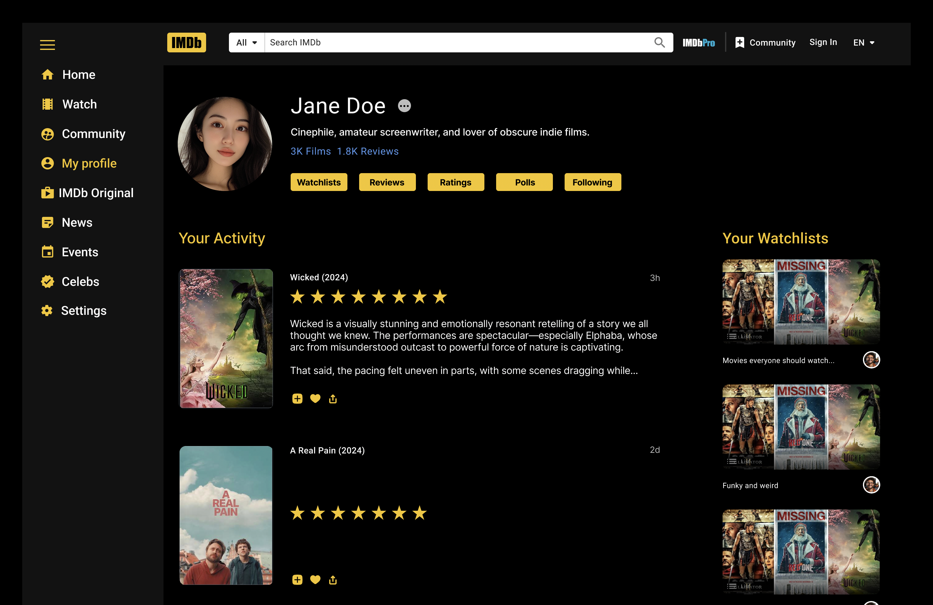
The new profile page design emerged from card sorting sessions where users consistently grouped personal content like activity, watchlists, and social connections together. Tree testing results showed that users expect to find these features under a dedicated profile section rather than scattered across different areas. The addition of profile customization elements and a ratings visualization responds to user feedback about wanting more personality and data insights in their IMDb presence. This consolidated approach creates a clear home for users' IMDb identity while making their contribution and interaction history more accessible and meaningful.
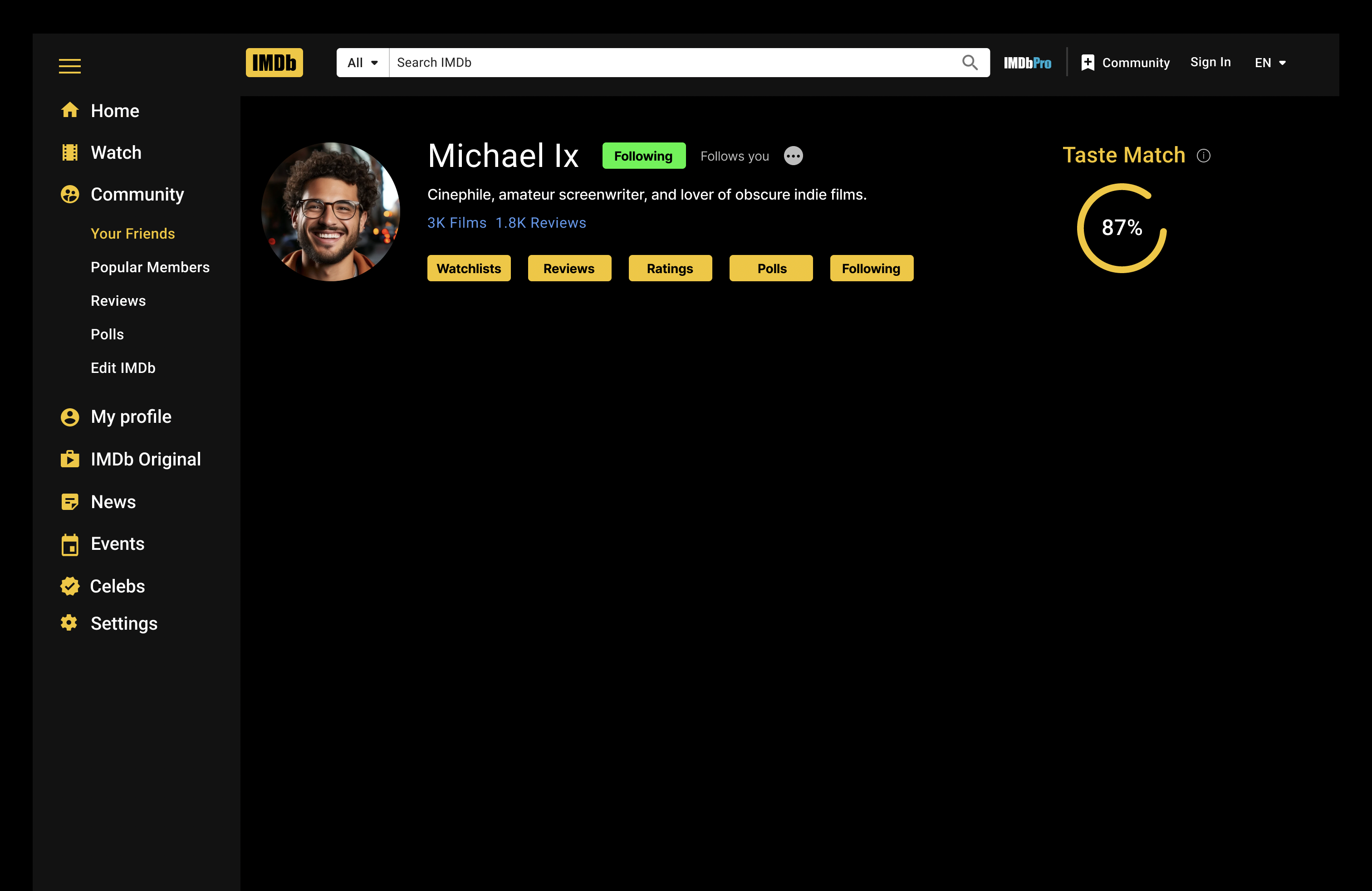
The "Taste Match" score is a feature designed to enhance personalized discovery and foster social engagement within the IMDb platform. This score indicates how closely a friend's watch history, viewing habits, and interests align with the user's own preferences. Displayed prominently on the "Friend Profile" page, it provides a clear, intuitive metric that supports the dual goals of personalization and social connection.
These changes transform IMDb from a pure database into a more engaging platform while maintaining its core strength as a comprehensive movie information source. The solution directly addresses the initial challenges of confusing navigation, lack of community features, and disconnected user experience.
Future iterations could focus on:
1. Expanding social featuresThis project demonstrates how user research can transform a traditional database into a modern, social platform while maintaining its core value proposition. The project demonstrated the importance of balancing information density with user experience, and the critical role of social features in modern entertainment platforms.