Cooper Hewitt
Transforming visual font characteristics into an immersive audio experience for Cooper Hewitt's Bungee font tester
This project creates an innovative accessibility solution for the Bungee font in Cooper Hewitt's collection. By mapping visual characteristics of type to corresponding audio experiences, this solution preserves the playful personality and design choices of the Bungee font for users who rely on screen readers. The project balances accessibility needs with preservation of the original work's integrity, transforming what's typically a flat screen reader experience into a rich, multisensory typography interaction.
Team Gloria Yang, Lan-Ting Ko, Nandita Malhotra, Smridhi Gupta
Role UX Researcher and Designer working in a team
Duration 3 weeks (April'25)
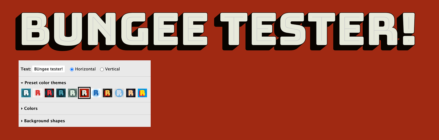
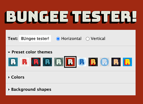
The Bungee font tester allows users to experiment with the font's distinctive features—chromatic layers, vertical/horizontal orientations, and decorative elements inspired by urban signage. However, this rich visual playground presents a significant accessibility barrier. From a web accessibility standpoint, the tester was lacking basic accessibility needs like keyboard navigation, a logical tab order, and defined heading and ARIA labels. This made it nearly impossible for users of assistive technologies to interact with the tool.
Beyond these technical gaps, screen reader users receive only the plain text content, missing the entire design experience that makes Bungee special
Standard screen reader approaches cannot convey the font's playful layering, color variations, and stylistic choices that sighted users enjoy through the tester interface. Cooper Hewitt needed a solution that would preserve both the original work's integrity and create an equally engaging experience for users relying on audio rather than visual information.
Understanding the needs of users with visual impairments who seek meaningful art experiences

Amina Rao
Behaviors
- Passionate about the arts—especially textile and digital installations
- Attends virtual gallery talks, uses audio guides frequently
- Feels left out of most visual-only exhibitions and online art platforms
- Loves podcasts and audio storytelling as alternative formats
Needs
- A way to understand visual art through narrative and sound
- Experiences that go beyond just alt text or surface-level descriptions
- A way to interact with art without strain or confusion
We approached this challenge by first analyzing what makes Bungee unique — its chromatic layers, vertical/horizontal orientation options, and decorative elements inspired by urban signage. The hypothesis was that these visual characteristics could be systematically mapped to audio equivalents, creating a parallel sensory experience. Through research on audio design principles and multiple prototype iterations, we developed a framework for "Sonic Typography" that translates visual elements into corresponding audio characteristics.
- Users who rely on screen readers often receive minimal information about display typography
- Sound characteristics (pitch, timbre, effects) can effectively convey visual weight, color, and layering
- Audio feedback must be balanced between informative and overwhelming
- Users prefer having control over audio intensity and feedback frequency
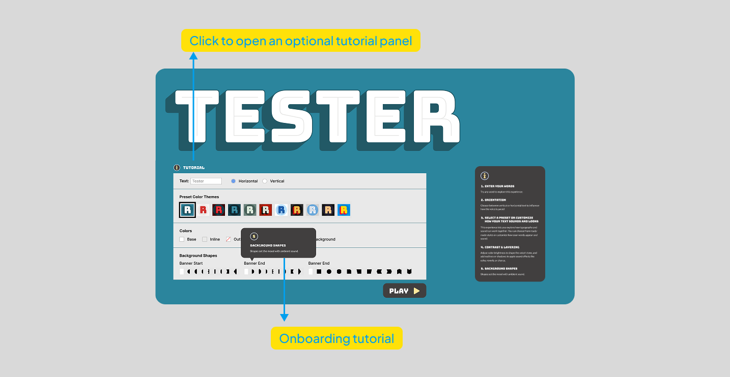
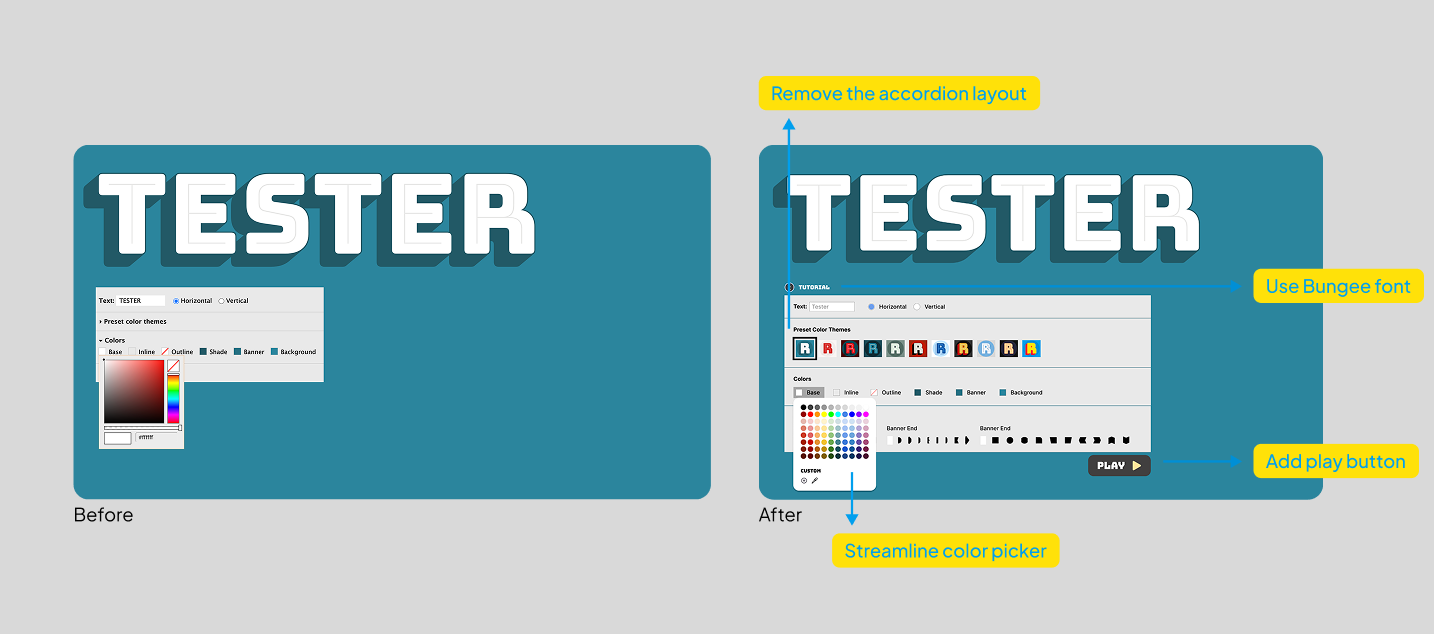
Part 1: Practical Web Accessibility Implementation
The first phase delivered immediate improvements to the Bungee font tester's accessibility through standard web best practices:
- Improved UI Structure: Removed accordion layouts in favor of always-visible controls that are easier to navigate with screen readers and keyboards
- Enhanced Keyboard Navigation: Made all interactive elements properly focusable, allowing keyboard-only users to access all features
- Clear Labeling System: Added descriptive text labels to color swatches and controls with proper ARIA attributes for screen reader announcement
- Guided Tutorial: Created an optional onboarding guide that helps users understand the non-traditional interface and navigation pattern
- Streamlined Controls: Simplified the color picker and added a prominent "Play" button for audio feedback
Part 2: Sonic Typography Mapping System
Building upon the improved technical foundation, the second phase introduced an innovative audio experience that translates visual characteristics into corresponding sound elements:
- Internal Contrast → Voice Depth: greater contrast produces deeper, more resonant voices while lighter contrasts use higher, airier tones.
- Overall Contrast → Timbre: Different color schemes are mapped to voice qualities that evoke similar emotional responses (bright colors = energetic voices, muted tones = softer voices).
- Layering → Audio Effects:Bungee's distinctive layers transform into specific audio effects:
- Inline = slight echo effect
- Outline = reverb depth
- Shade = chorus effect that adds richness
- Orientation → Pacing: Vertical text orientation becomes a distinct rhythmic pattern with deliberate pauses between letters, clearly distinguishing it from horizontal text flow.
- Background Shapes → Ambient Sound: Different decorative elements create distinctive audio environments:
- Banner shapes produce continuous ambient tones
- Block shapes create punctuated sound textures
- Ornamental elements add subtle audio accents
See the Sonic Typography System in Action
This demonstration shows how the Sonic Typography system translates visual font characteristics into audio. The user can toggle between different font styles and settings to hear how the audio representation changes accordingly.
This dual-approach solution demonstrates how practical accessibility compliance and creative sensory translation can work together:
- Creates an immediately accessible experience (Phase 1) while developing a more innovative approach (Phase 2)
- Balances technical requirements with creative preservation of the font's unique characteristics
- Establishes a framework that could extend to other typographic works in the collection
- Provides multiple pathways to accessibility that meet different user needs and preferences
improvements implemented for better accessibility
made keyboard navigable and screen reader friendly
added to help users understand the non-traditional interface
mapped to corresponding audio elements
What I Learned:
- Implementation Balance: Finding the right mix between immediate practical improvements and innovative solutions was crucial
- Progressive Enhancement: Building on standard screen reader functionality rather than replacing it ensured both baseline accessibility and enhanced experiences
- User Testing Insights: Screen reader users particularly valued the guided tutorial and clear navigation patterns from Phase 1
- Cross-Modality Design: Designing across sensory modalities revealed new possibilities for inclusive typography
What I'd Improve:
- Integration Refinement: Better blend the standard accessibility features with the sonic typography system
- Personalization Options: Implement user profiles to save preferred audio and visual settings
- Expanded Testing: Conduct more extensive testing with diverse assistive technology users
- Performance Optimization: Improve audio processing efficiency for better mobile performance
- Design System Documentation: Create clear guidelines for extending this approach to other fonts in the collection
This project reinforced my belief that accessibility can be both technically compliant and creatively engaging. By approaching accessibility as a design opportunity rather than just a compliance requirement, we can create more inclusive experiences that maintain the integrity and expressiveness of the original design intent.